
In the coming weeks we’ll be launching a fresh look and feel for both our corporate brand, and Spex. The new brand work is the result of a lot of hard work by a lot of talented people, and is a reflection of Medifab’s position as a leading Australasian manufacturer and supplier of clinical equipment.
The launch includes new logotypes for Medifab and Spex, and new supporting imagery. Read below for some insight into the thinking behind our new brand, along with examples of the new resources and collateral we have developed.
[Images]
Design Background
Medifab is a family company built on genuine compassion for people with disabilities. We’ve always looked for new ways to make life more comfortable for our customers. And we always will.
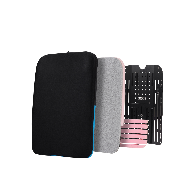
From the world-leading Spex seating system to wheelchairs, pushchairs and sleep aids, Medifab is renowned for turning innovation and ingenuity into unparalleled comfort; solutions that evolve as the needs of the individual user change.
Support is comfortable. Support is unique. Support is moulded to the individual.
Our new identities reflect this.
The identities for Medifab and Spex take clear cues from the products themselves, featuring logotypes and typography with round, soft, comfy edges.
[Images]
In the case of Spex, the logo subtly references the fact that you can add or remove elements from the Spex support system as and when necessary.
The broader imagery expands on the overarching concept and is expressed through graphic curves, a suite of soft gradients and a warm, inviting colour palette.
Like our products, the end result is beautiful in its simplicity; a look and feel that will serve both brands for years to come, and wherever we expand globally.
[Images]
e hope you’re as excited about our new look as we are! Share your thoughts here on the new Medifab.